
Many feel compelled to be connected around the clock because we are afraid we’ll miss something important. There is a growing movement to step out and create ‘quiet zones’ to disconnect from technology and unwind, giving ourselves time to stop and be still,” said Leatrice Eiseman, executive director of the Pantone Colour Institute. “Colour choices follow the same minimalistic, ‘en plein air’ theme, taking a cue from nature rather than being reinvented or mechanically manipulated. Soft, cool hues blend with subtle warm tones to create a soothing escape from the everyday hustle and bustle.”
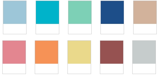
Aquamarine, Scuba Blue, Lucite Green, Classic Blue, Toasted Almond, Strawberry Ice,Tangerine,
Custard. Marsala and Glacier Grey are the colours we have to look forward to once the long cold winter is over.
Pantone names top 10 colours for spring/summer 2015
Top of the women’s colour chart is ‘Aquamarine’, an airy, ethereal blue with a cool, dreamy feel that Pantone states is a soft shade that acts as a stress reducer. It is also a hue that mixes well with the other blues and greens in the top 10. Which is offset with the “carefree playfulness” of ‘Scuba Blue’ that is more of an energising shade that takes the wearer “off to an exotic paradise”, while the soft, serene green of ‘Lucite Green’ invigorates the body and mind and offers a fresh sense of clarity.
 Other popular hues will be ‘Toasted Almond’ a suntanned neutral, which pairs well with the light, nurturing coral tone of ‘Strawberry Ice’ as seen at Rebecca Minkoff, and ‘Tangerine’ an energising, non-jarring take on orange that adds a pop of colour for spring. Rounding up the top 10 is an all-encompassing yellow ‘Custard’, which combines well with ‘Classic Blue’, and the warm red-brown colour of ‘Marsala’.
For men the colour palette focuses on “uncontrived natural and deeper tones” for an “unassuming and sophisticated” top 10. A favourite for the men for SS15 will be ‘Dusky Blue’, a cool, calm serenity, representative of the sky, which pairs well with ‘Glacier Gray’ and ‘Treetop’, a “healthy harmonious green” that offers a reassuring presence.
‘Classic Blue’ is the core anchoring hue, while ‘Toasted Almond’ continues as another neutral. ‘Woodbine’ is a tropical green, which Pantone says pairs well with the earthy and rugged associations of ‘Sandstone’. Which contrast with the palette’s most fashion-forward hue of ‘Lavender Herb’ and the rich colour of ‘Marsala’.
Images: Pantone SS15
No comments:
Post a Comment